It seems like everyone’s doing it, so I thought I’d spend some time focussing on getting my own VS.NET color scheme polished off.
While developing the scheme I’ve focused on a number of concepts that I believe in (whether they are right or wrong – I believe in them):
- Reading light text on a dark background is much easier than doing it the other way around. Don’t believe me? Take a photo of the text written on the base of a light globe while it’s turned on, then try and read the text – it’s almost impossible. Now, invert the colors and try again – easy!
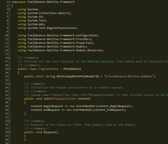
- High contrast makes reading harder too – pure white on pure black will strain your eyes a lot faster than an off white on a dark grey background. Most people can’t even tell that the background color in the screenshot below is a dark brown rather than a pure black – but it is, and it makes a difference.
If you want to give it a whirl, download the Consolas font then download the .vssettings file. Keep in mind that this is only a v1 – the C# looks awesome, but I’ve yet to format the XML and HTML. Of course, I haven’t even tested VB.NET as I don’t even have it installed! I’ll post a v2 with colors for everything as soon as I get sick of looking at ugly XML/HTML.
So, without further ado, here’s what I’ve come up with so far:

Great scheme. But you are right, the coloring of XML/HTML is really bad which makes it pretty unusable in some situations. Especially if you have dark grey text ;-)).
Let us know when v2 is up!
Elmar
Do you know this this one already?
http://weblogs.asp.net/infinitiesloop/archive/2006/08/06/Join-the-Dark-Side-of-Visual-Studio.aspx
Did you ever create a version that supports html / xml ? 🙂
That’s very, very nice – thanks! 🙂
I kindda worked on the XML/HTML areas and posted the scheme on my blog.
Welcome to check it out
http://blog.codeofdefiance.com/resources/7367/assets/documents/Misc/MidtonesVariant.zip
Also, available at IDE-Hot-or-Not where I found the original.
Hi.
Good design, who make it?
Hi naisioxerloro, The original design discussed in this post was designed by me. Some other nice variants have been discussed in the comments.
In regards to the above comment: I have modified over the course of a few years now, this dark color scheme. I’m in front of my IDE pretty much all day every day, and this is soothing on my eyes and also highly usable (IMO)
VS 2008 – Preview and download link
http://www.jheidt.com/archive/2007/12/13/visual-studio-color-scheme.aspx